Giz Agency

Repositioning and changing course with an impactful rebranding!

Therefore, the purpose of my rebranding work was clear: to foster client loyalty through friendly, clear, and inspiring communication that instilled good humor and confidence. This was designed to solve the problem of clients leaving before work even started.


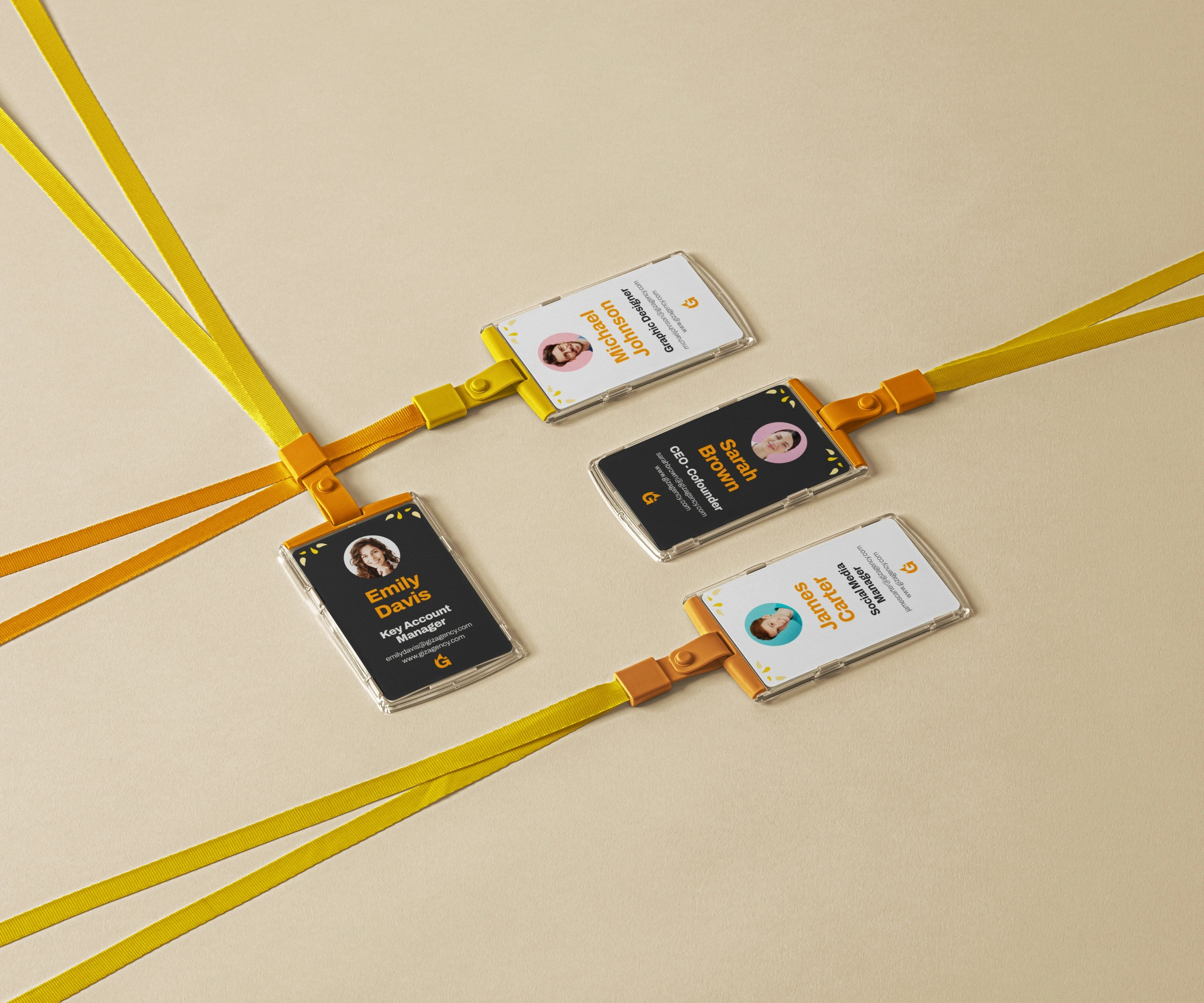
First, I began by outlining all the agency's values and character nuances on paper, identifying keywords such as: energy, warmth, friendship, expertise, love, and strength. These words guided my work, and I translated them into a visual design.

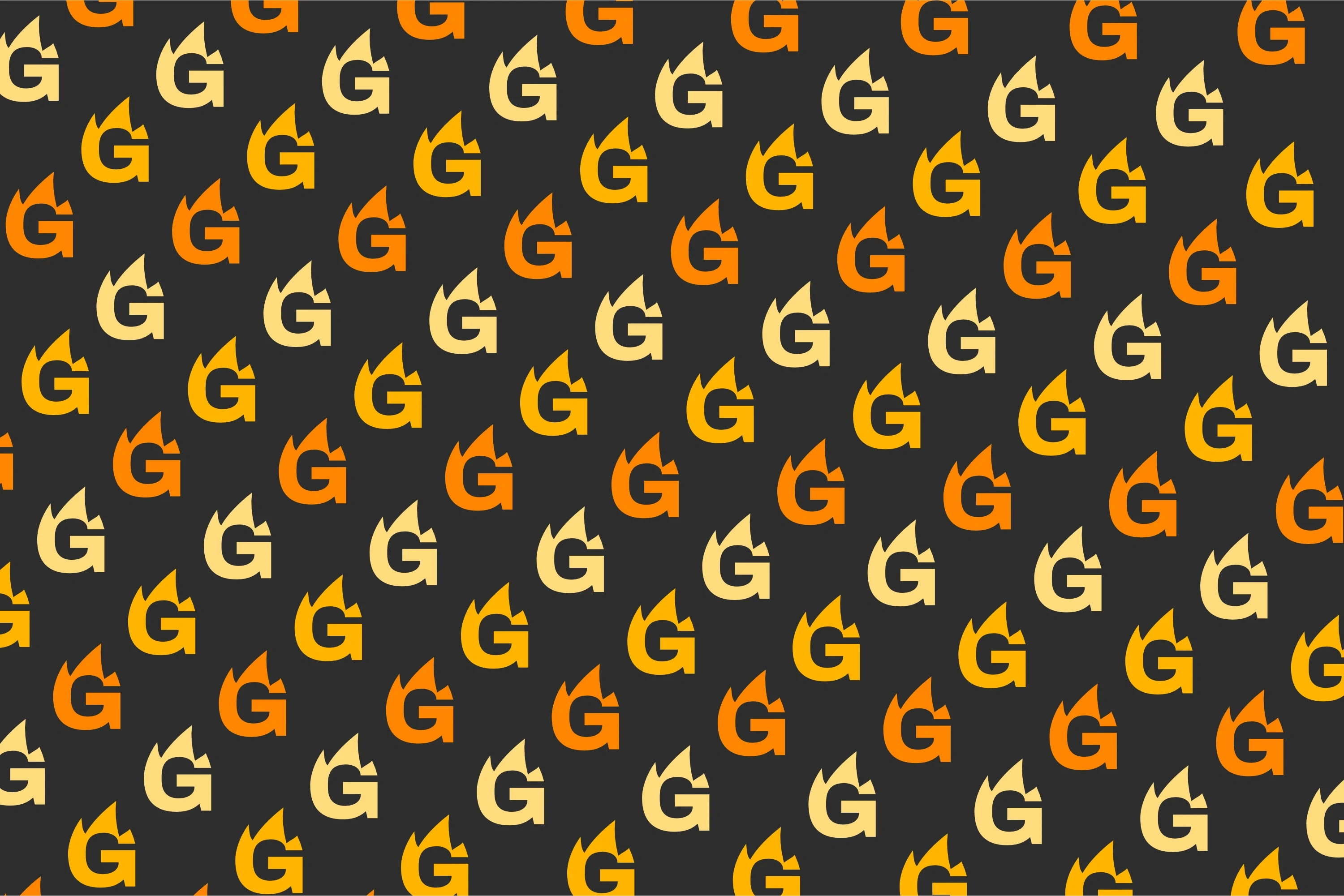
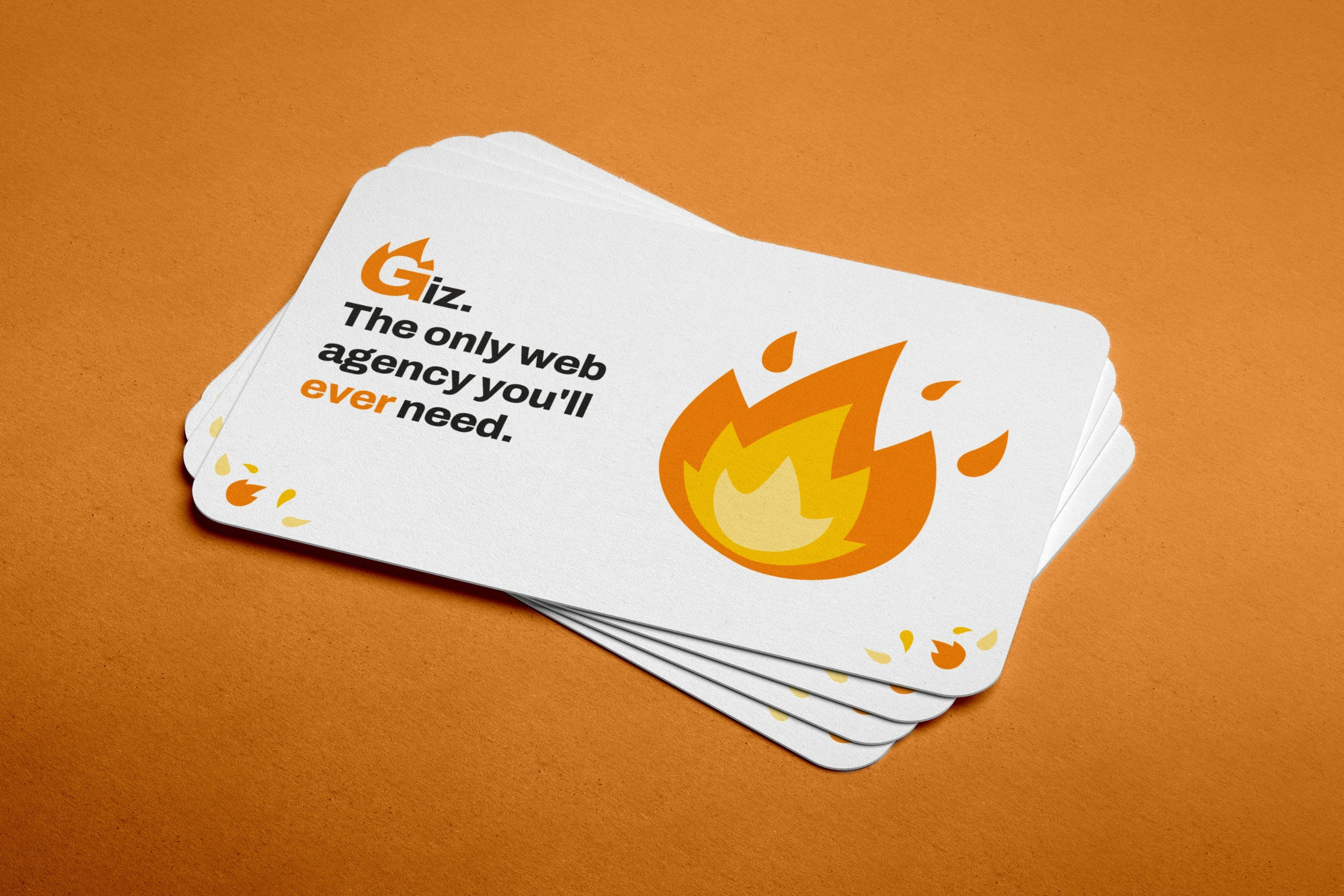
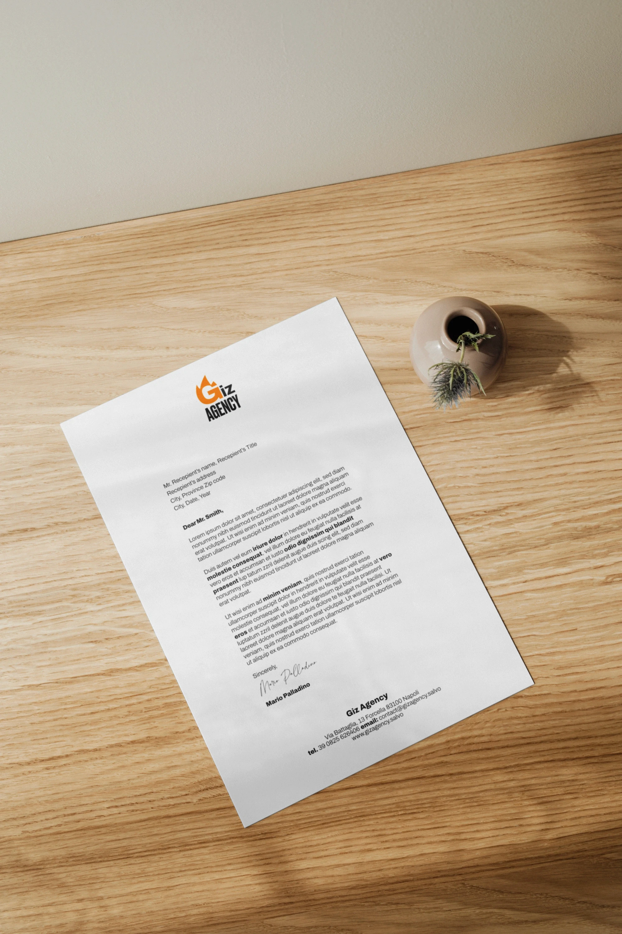
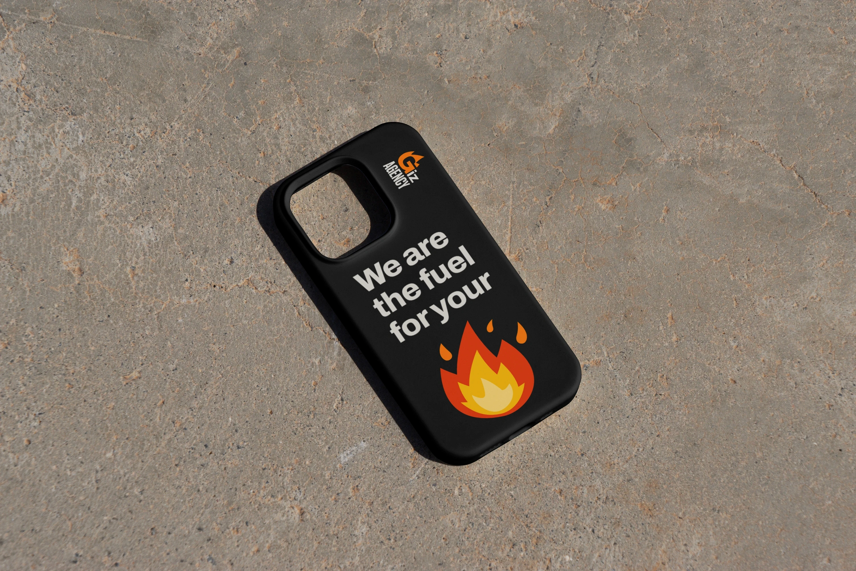
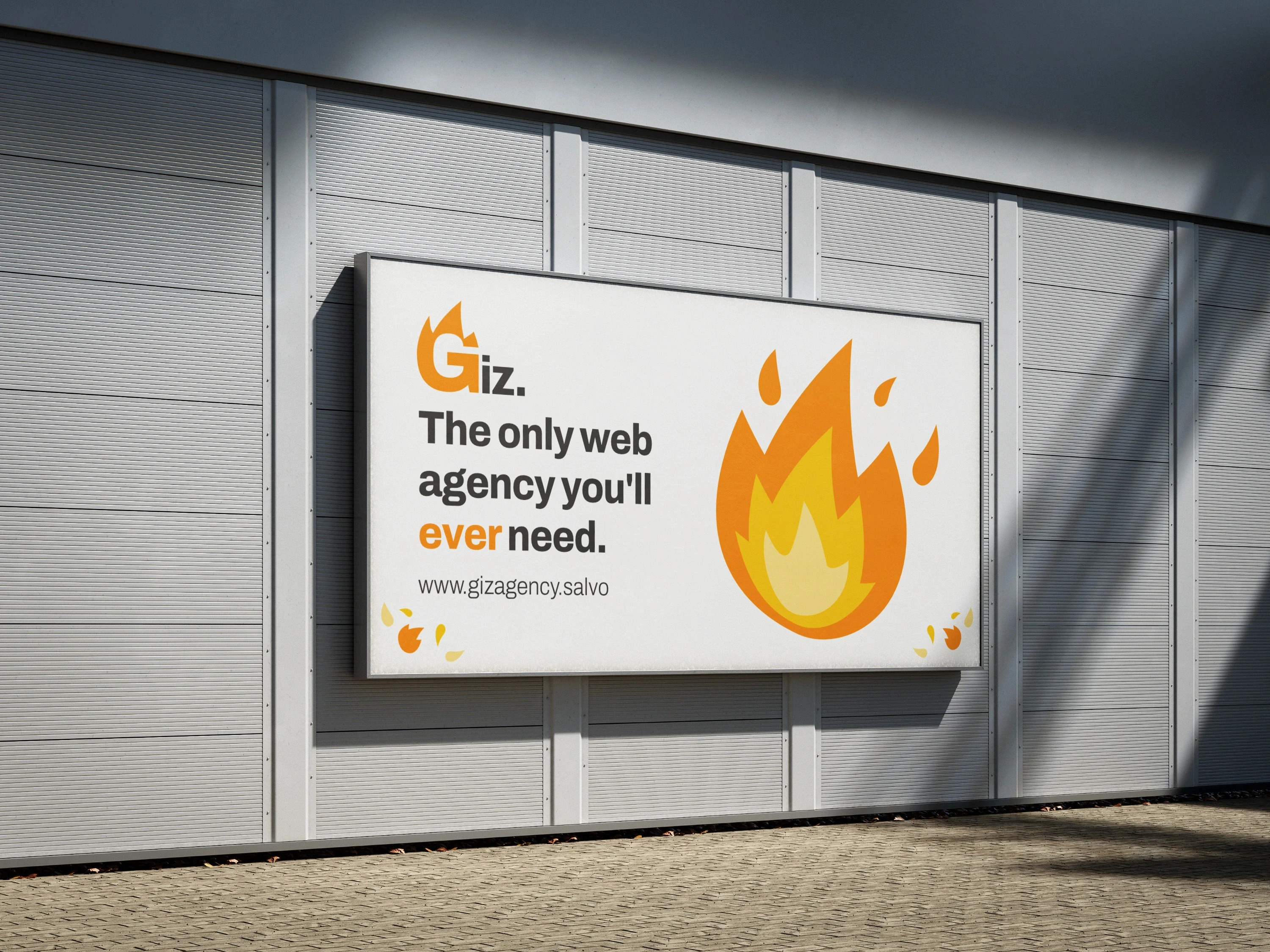
To best express the feeling of an "explosion of energy" and warmth, I used a stylized flame 🔥.

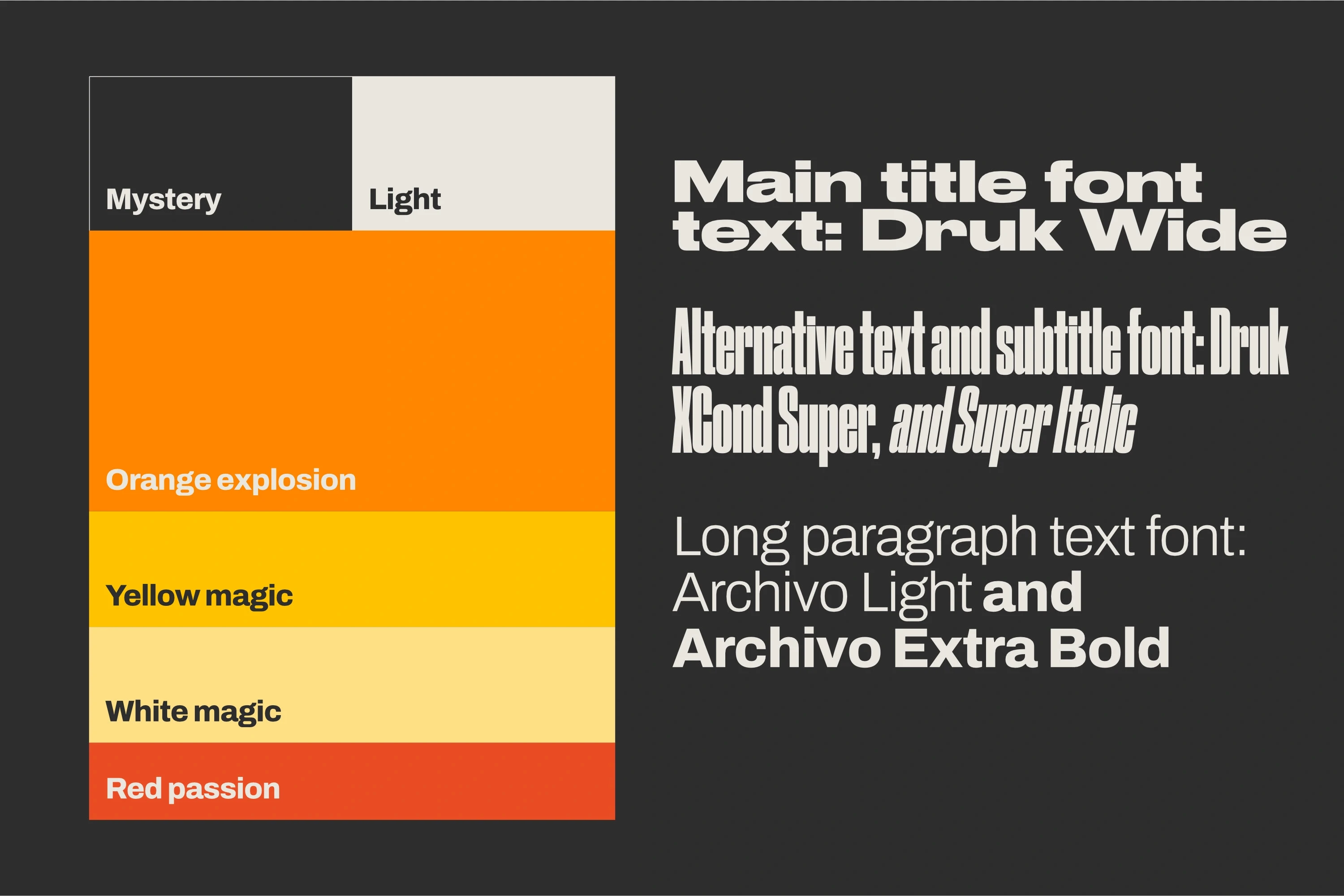
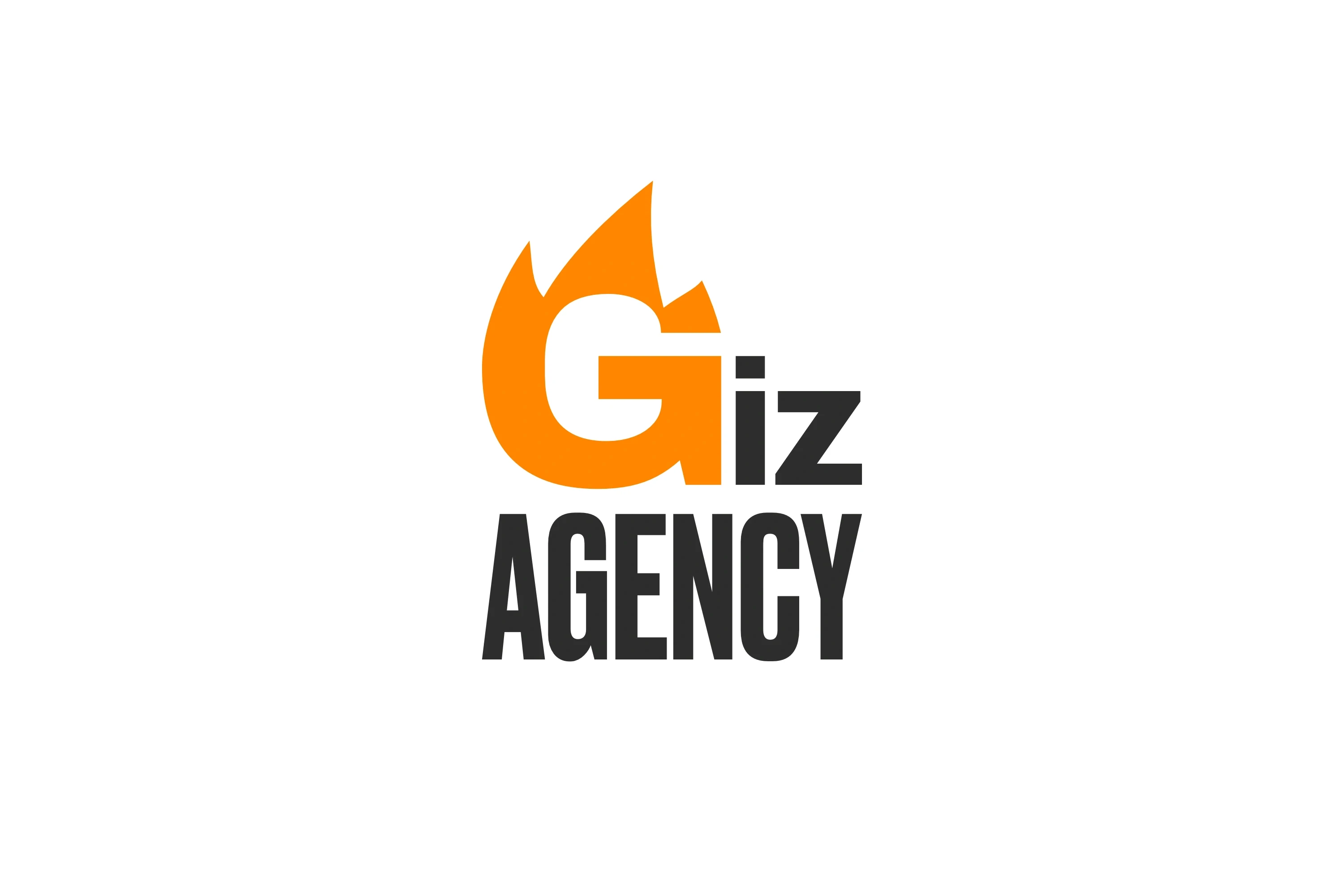
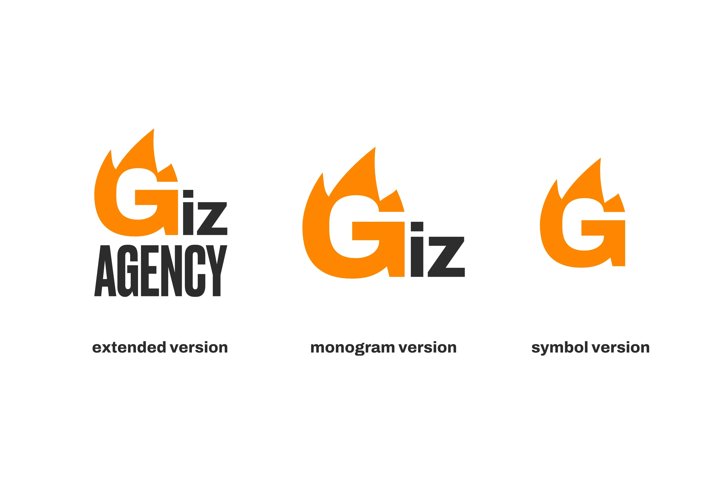
I simplified it for easy comprehension and visualization across all sizes, and reduced it to the brand's three distinctive colors.


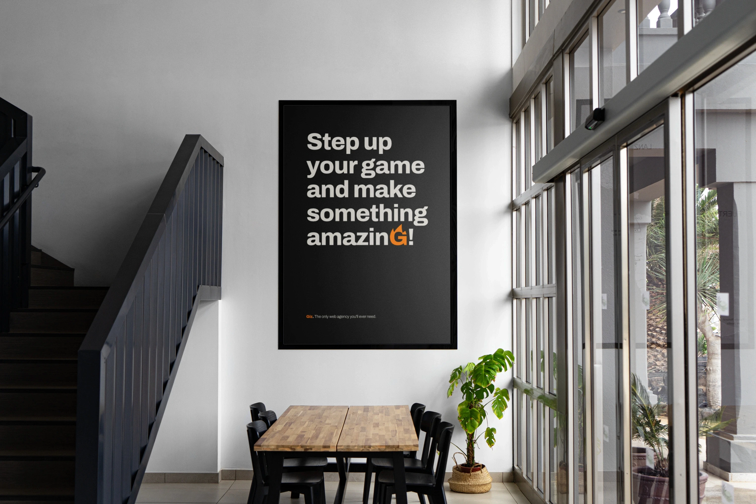
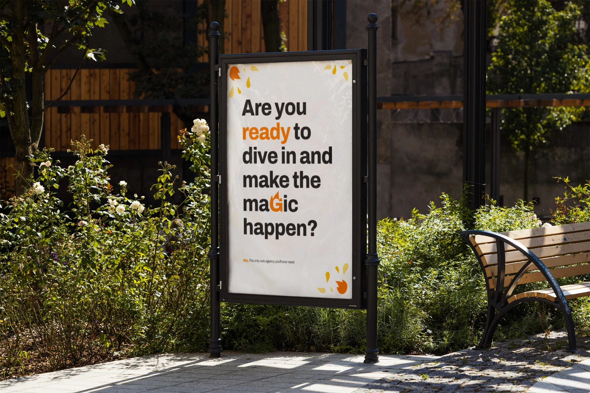
The chosen fonts also evoke power and stability, grounding each letter of every word and conveying the reliability the agency offers. The visuals are powerful and motivating, communicating clarity through a minimalist style and expertly used energetic colors.

Now, Giz Agency has a clear identity and can re-enter the market with greater awareness and possibilities, significantly increasing their chances of acquiring new clients and achieving new success!

This rebranding was crucial because, until then, they had never possessed a clear, strong identity capable of successfully communicating with clients and potential clients.

This led to numerous missed opportunities, as clients often left before projects even began.

Giz Agency is a communication agency based in Naples, with whom I collaborated between 2023 and 2024.


Their strength lies in a young team that has built a solid bond over time. Being part of it allowed me to create a brand identity that truly reflected their values and the agency's character.
Giz Agency

Repositioning and changing course with an impactful rebranding!


Giz Agency is a communication agency based in Naples, with whom I collaborated between 2023 and 2024.


Their strength lies in a young team that has built a solid bond over time. Being part of it allowed me to create a brand identity that truly reflected their values and the agency's character.


This rebranding was crucial because, until then, they had never possessed a clear, strong identity capable of successfully communicating with clients and potential clients.

This led to numerous missed opportunities, as clients often left before projects even began.


Therefore, the purpose of my rebranding work was clear: to foster client loyalty through friendly, clear, and inspiring communication that instilled good humor and confidence. This was designed to solve the problem of clients leaving before work even started.


First, I began by outlining all the agency's values and character nuances on paper, identifying keywords such as: energy, warmth, friendship, expertise, love, and strength. These words guided my work, and I translated them into a visual design.


To best express the feeling of an "explosion of energy" and warmth, I used a stylized flame 🔥.

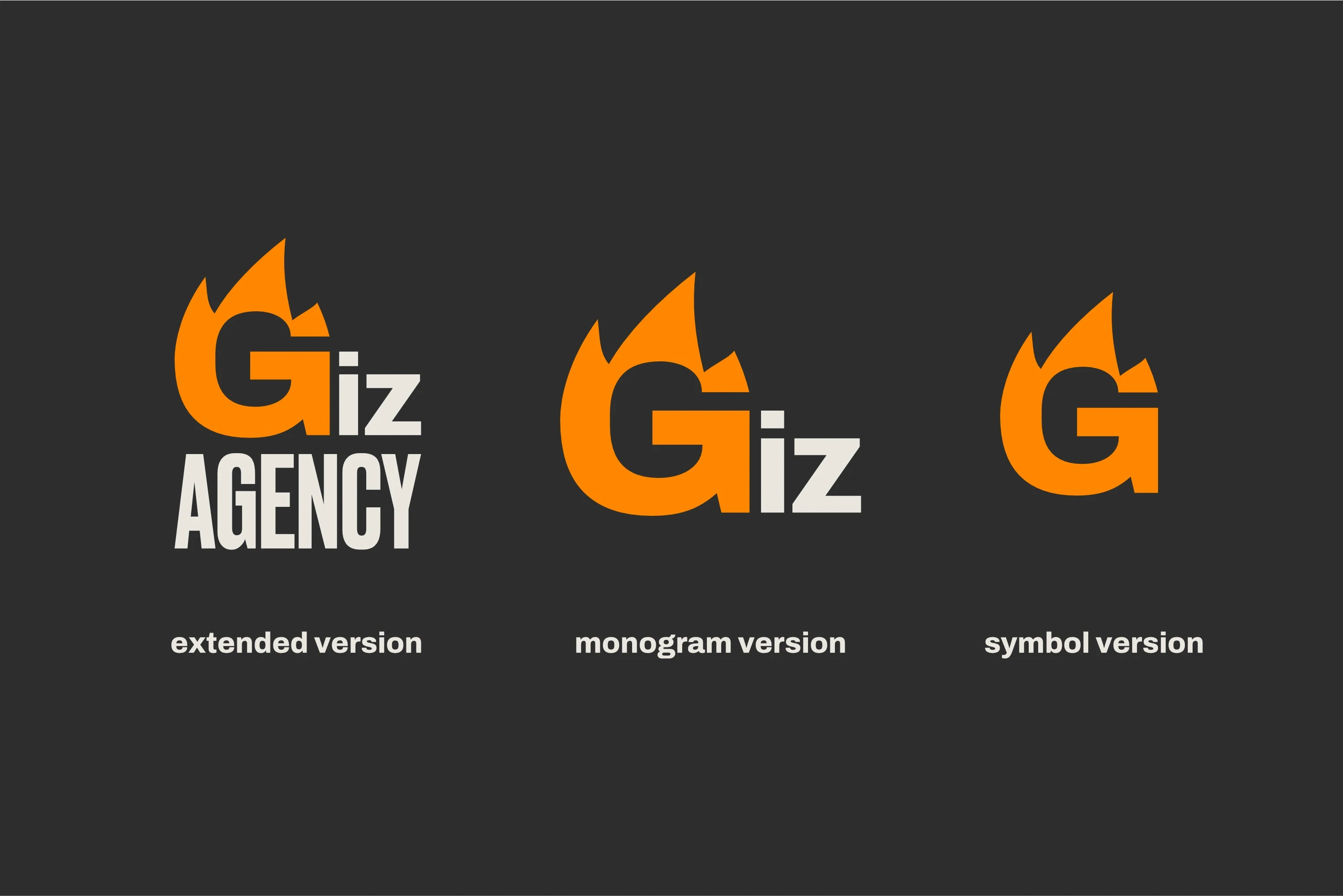
I simplified it for easy comprehension and visualization across all sizes, and reduced it to the brand's three distinctive colors.


The chosen fonts also evoke power and stability, grounding each letter of every word and conveying the reliability the agency offers. The visuals are powerful and motivating, communicating clarity through a minimalist style and expertly used energetic colors.


Now, Giz Agency has a clear identity and can re-enter the market with greater awareness and possibilities, significantly increasing their chances of acquiring new clients and achieving new success!


Join others in elevating your image

Attract new clients and stand out from the competition with a professional brand identity

Book your free consultation now,
limited spots available!

Book your free consultation now,
limited spots available!

We work with a limited number of clients at a time to ensure dedicated attention and care for every project. This way, you get the best, with no compromises.