Errico Porzio
A breath of fresh air for the web's most beloved pizzaiolo!
Rebranding Project
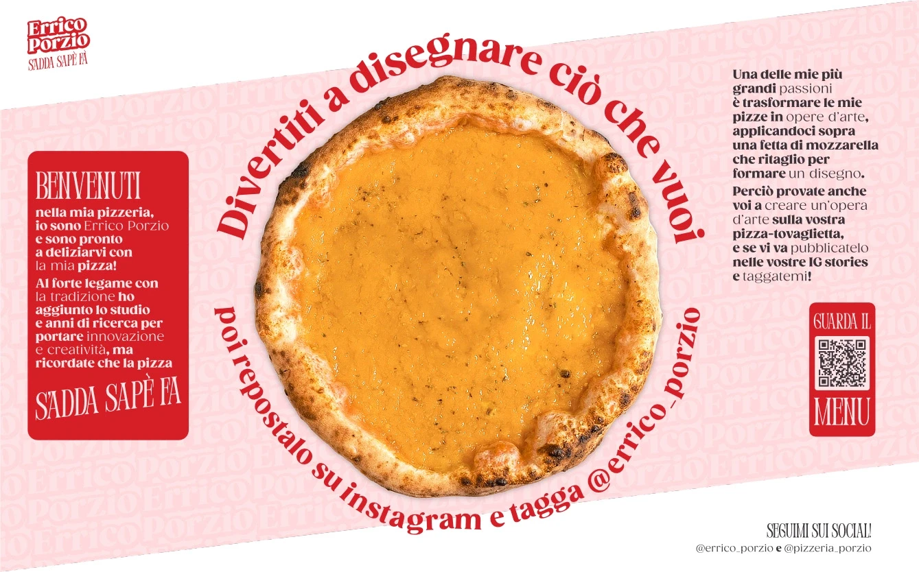
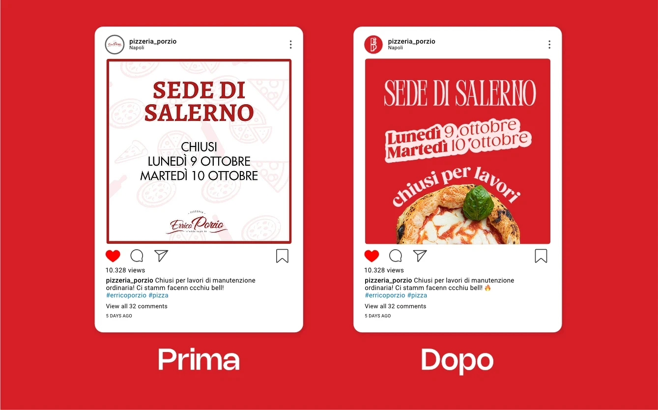
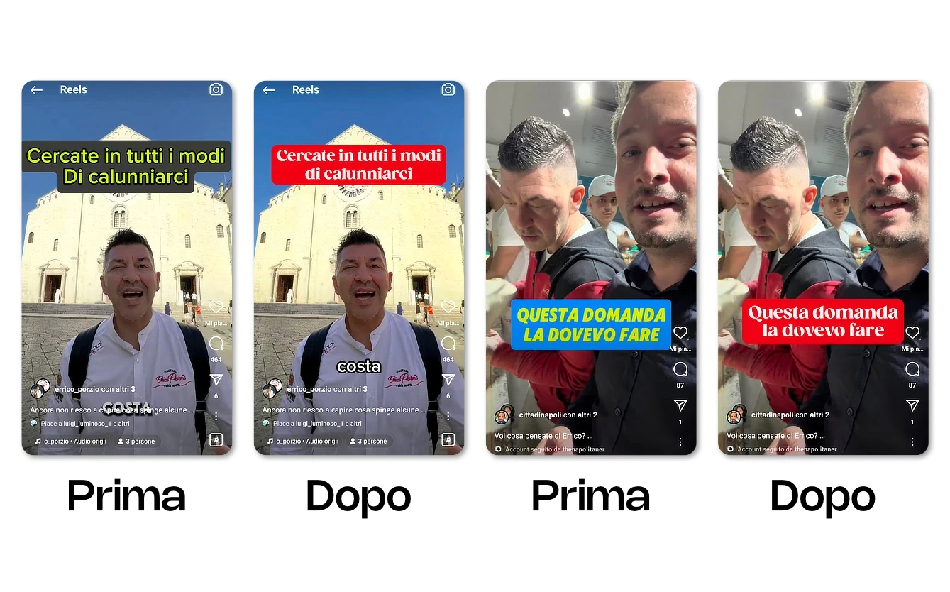
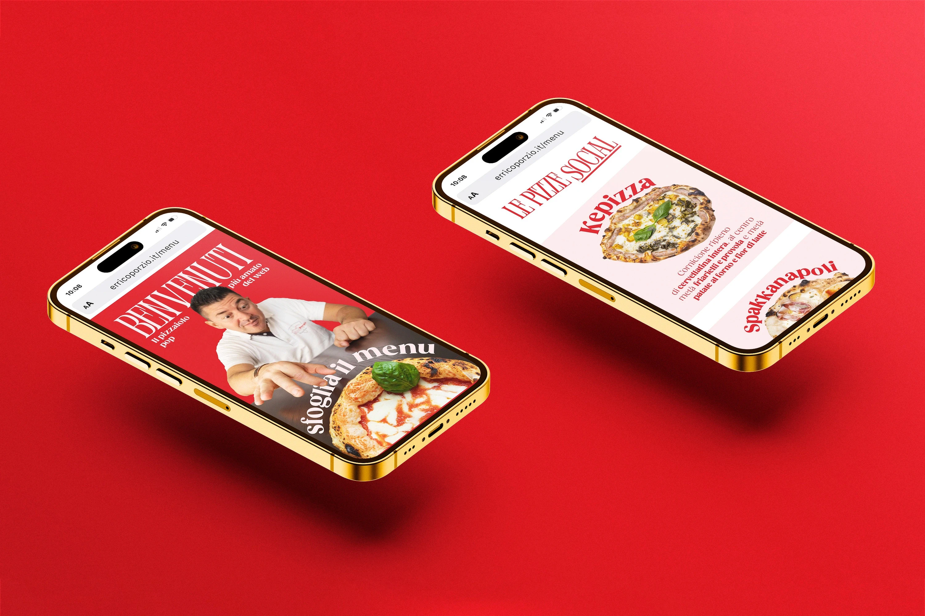
That's why I wanted to pay homage to this great pizzaiolo who has brightened my tough days by bringing moments of serenity and well-being. I created a complete, 360° brand identity for him, translating his lively and playful character into a visual style that extends to all his pizzerias, social media content, and anything else he chooses to do.
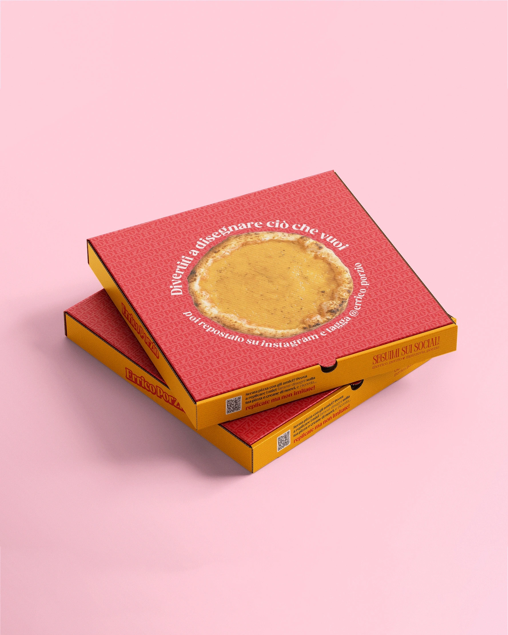
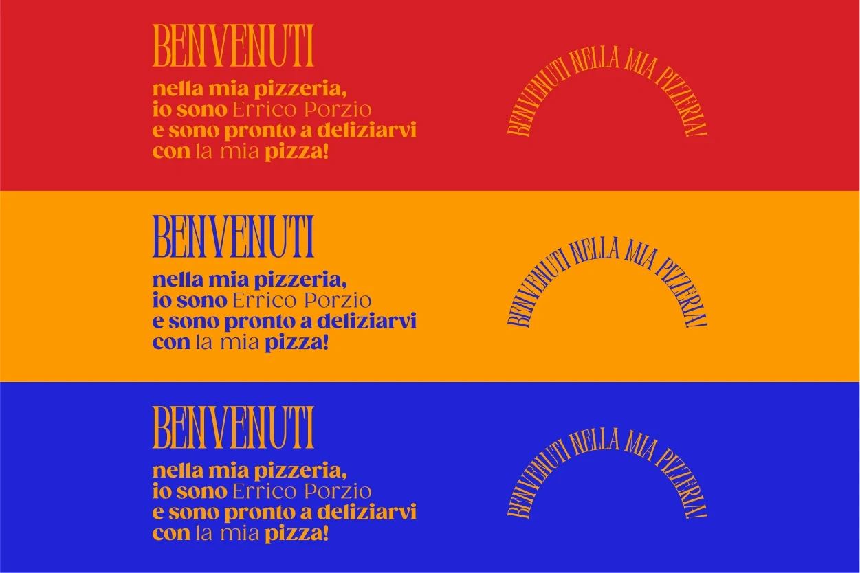
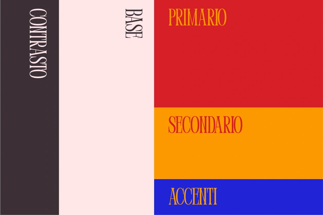
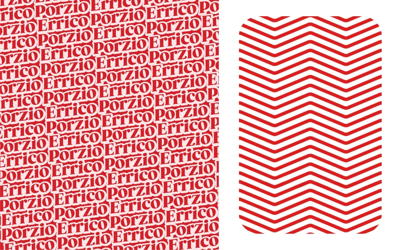
I selected powerful and vibrant colors to stir the emotions of viewers, like red, which communicates passion (besides being the main color of pizzas, with an ingredient like tomato). This color was already present in his old palette, but I modified it to further amplify its power and pair it better with other colors. The fonts are simple yet impactful, with soft lines that evoke tradition's past while remaining modern to communicate study and innovation.
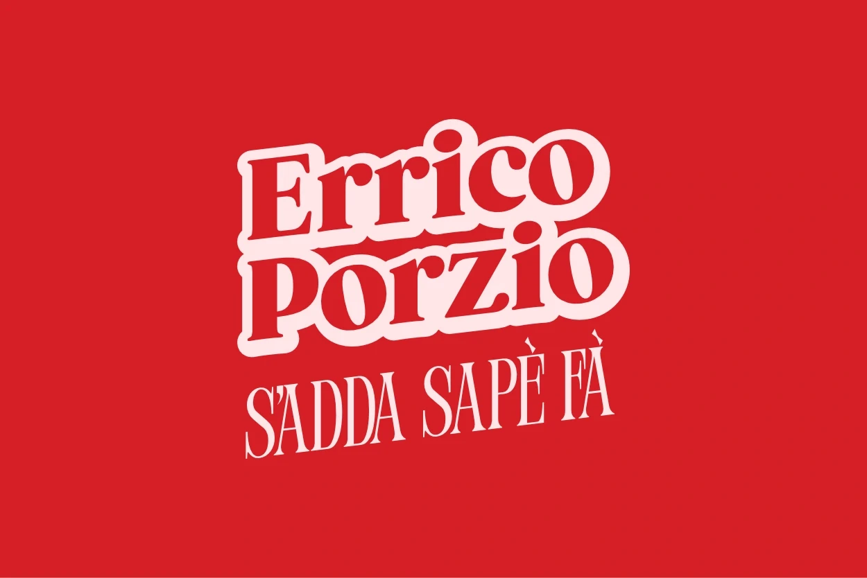
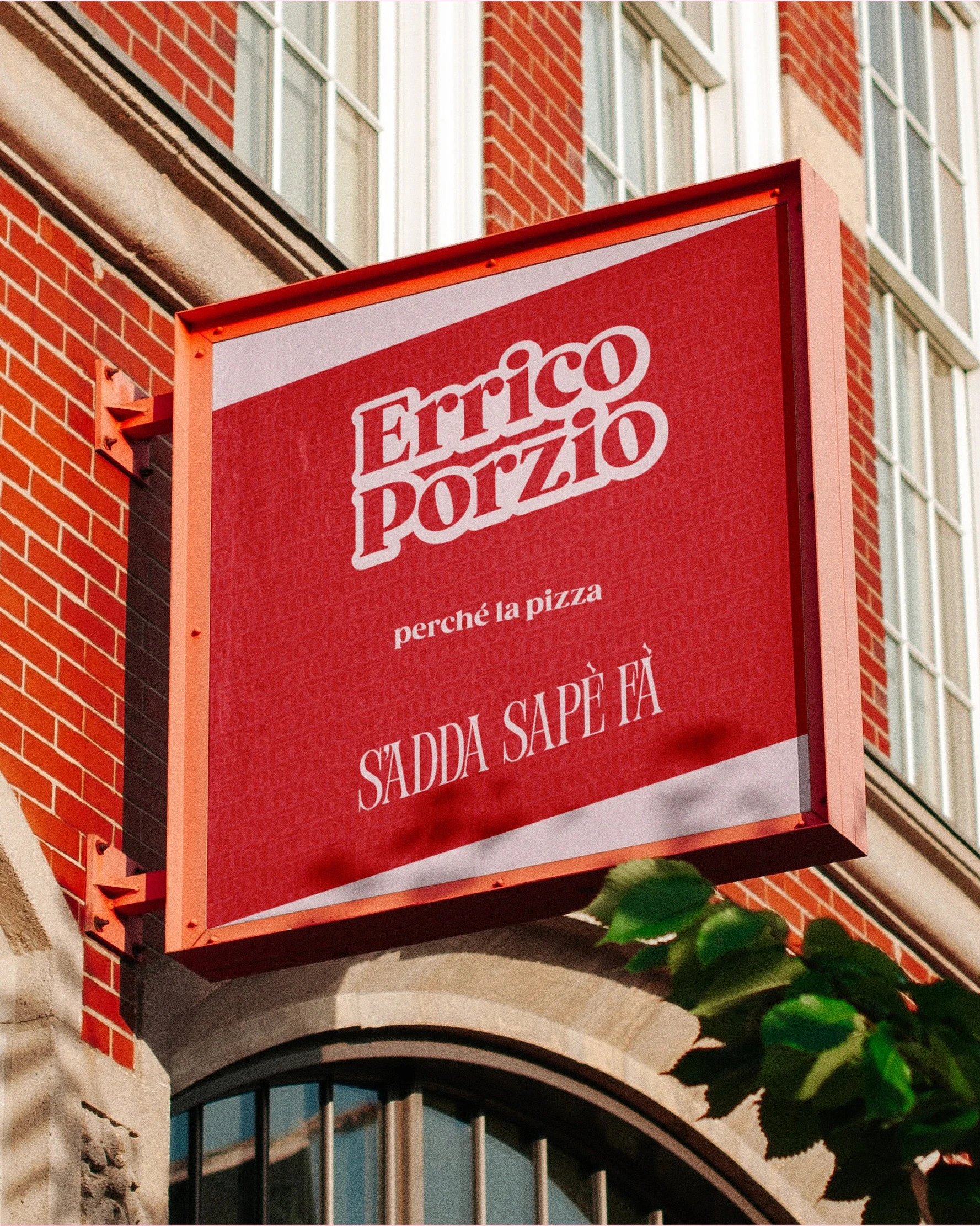
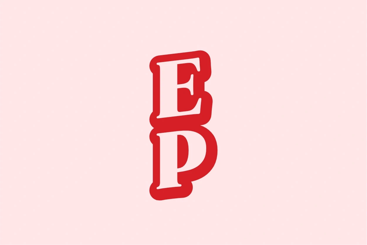
The logo is a logotype – a logo formed by text – into which I incorporated his most famous slogan: "s'adda sapè fà" (a Neapolitan dialect phrase meaning "you gotta know how to do it"). I chose not to include symbols to avoid distracting from his image, which has become a recognizable symbol of his brand, opting instead for a perfectly intertwined logotype.
This is a personal, conceptual project.
This well-deserved success, however, hadn't led to an aesthetic and graphic evolution within his communication over time, leaving his persona and pizzerias somewhat disconnected and lacking a powerful link.
Errico Porzio certainly needs no introduction; he's the most famous and beloved pizzaiolo on the web, with millions of views, he's become a pizza institution!
Errico Porzio
A breath of fresh air for the web's most beloved pizzaiolo! Rebranding Project
Errico Porzio certainly needs no introduction; he's the most famous and beloved pizzaiolo on the web, with millions of views, he's become a pizza institution!
This well-deserved success, however, hadn't led to an aesthetic and graphic evolution within his communication over time, leaving his persona and pizzerias somewhat disconnected and lacking a powerful link.
That's why I wanted to pay homage to this great pizzaiolo who has brightened my tough days by bringing moments of serenity and well-being. I created a complete, 360° brand identity for him, translating his lively and playful character into a visual style that extends to all his pizzerias, social media content, and anything else he chooses to do.
I selected powerful and vibrant colors to stir the emotions of viewers, like red, which communicates passion (besides being the main color of pizzas, with an ingredient like tomato). This color was already present in his old palette, but I modified it to further amplify its power and pair it better with other colors. The fonts are simple yet impactful, with soft lines that evoke tradition's past while remaining modern to communicate study and innovation.
The logo is a logotype – a logo formed by text – into which I incorporated his most famous slogan: "s'adda sapè fà" (a Neapolitan dialect phrase meaning "you gotta know how to do it"). I chose not to include symbols to avoid distracting from his image, which has become a recognizable symbol of his brand, opting instead for a perfectly intertwined logotype.
This is a personal, conceptual project.
Join others in elevating your image
Attract new clients and stand out from the competition with a professional brand identity
Book your free consultation now,
limited spots available!
Book your free consultation now,
limited spots available!
We work with a limited number of clients at a time to ensure dedicated attention and care for every project. This way, you get the best, with no compromises.
