Blessed
A fashionable brand identity for a high-class boutique
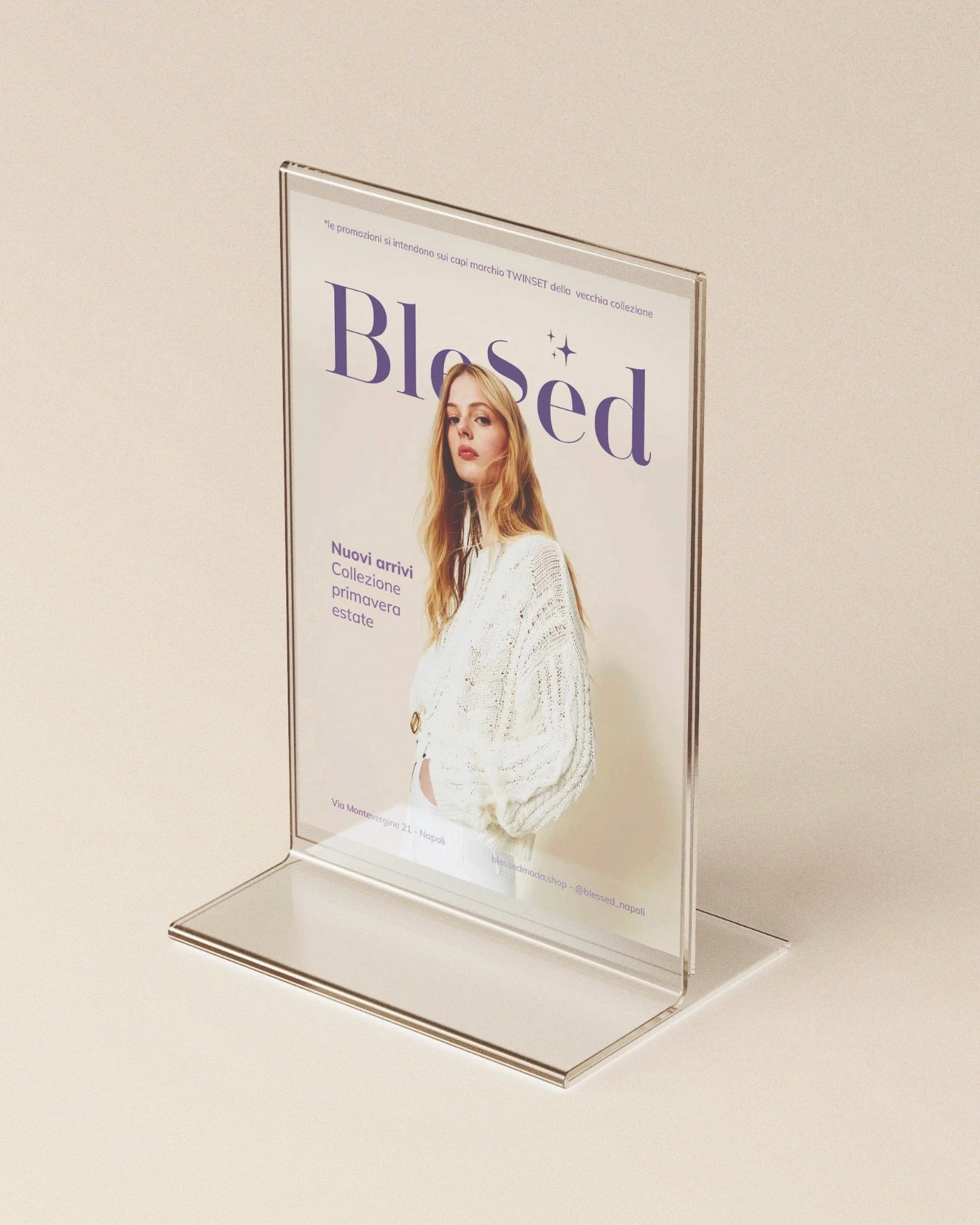
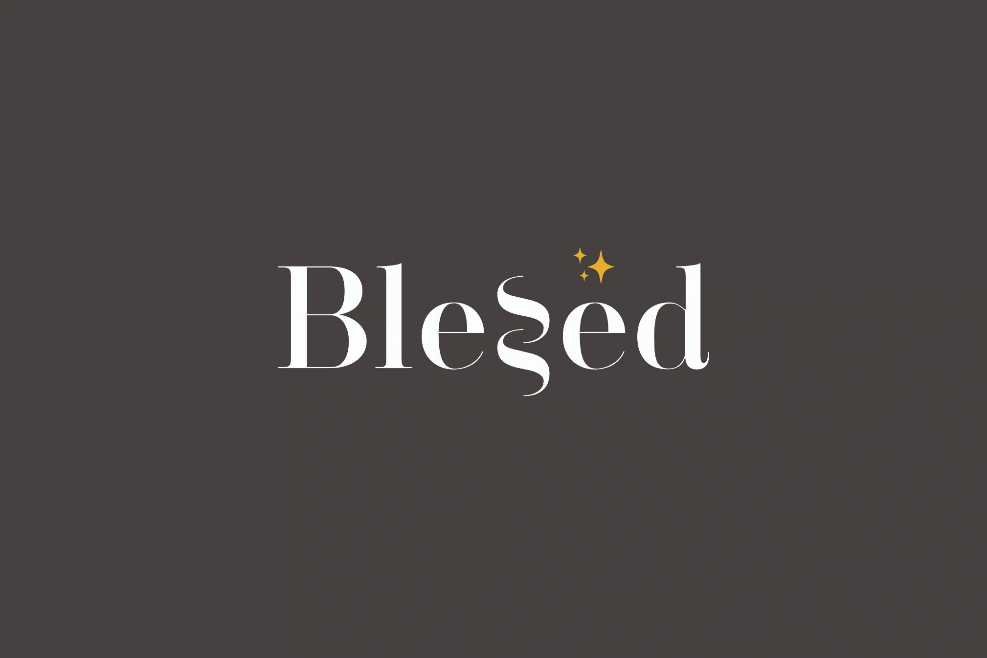
In this case, I chose a logotype, which is the standard in the brand's market, ensuring strong recognition and brand solidity. This helps it reach people as a trustworthy boutique that can make a difference in their lives. To convey the union of the two women, I intertwined the 'S's in the logo, like a curl of hair, and added stars to give a personal touch that represents them both.
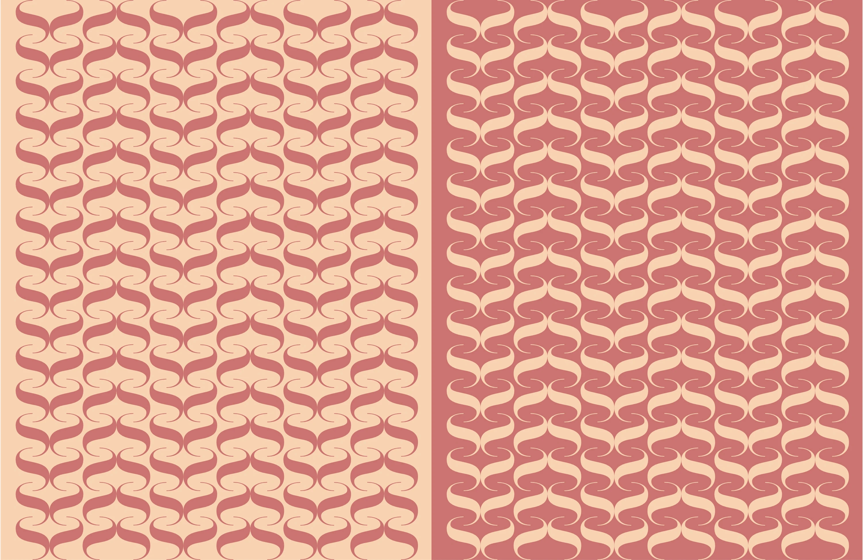
Consequently, the font had to be chosen with great care. I opted for a modern serif font (with serifs) to confer elegance and lightness, complemented by a sans-serif font (without serifs) to improve readability and finesse.
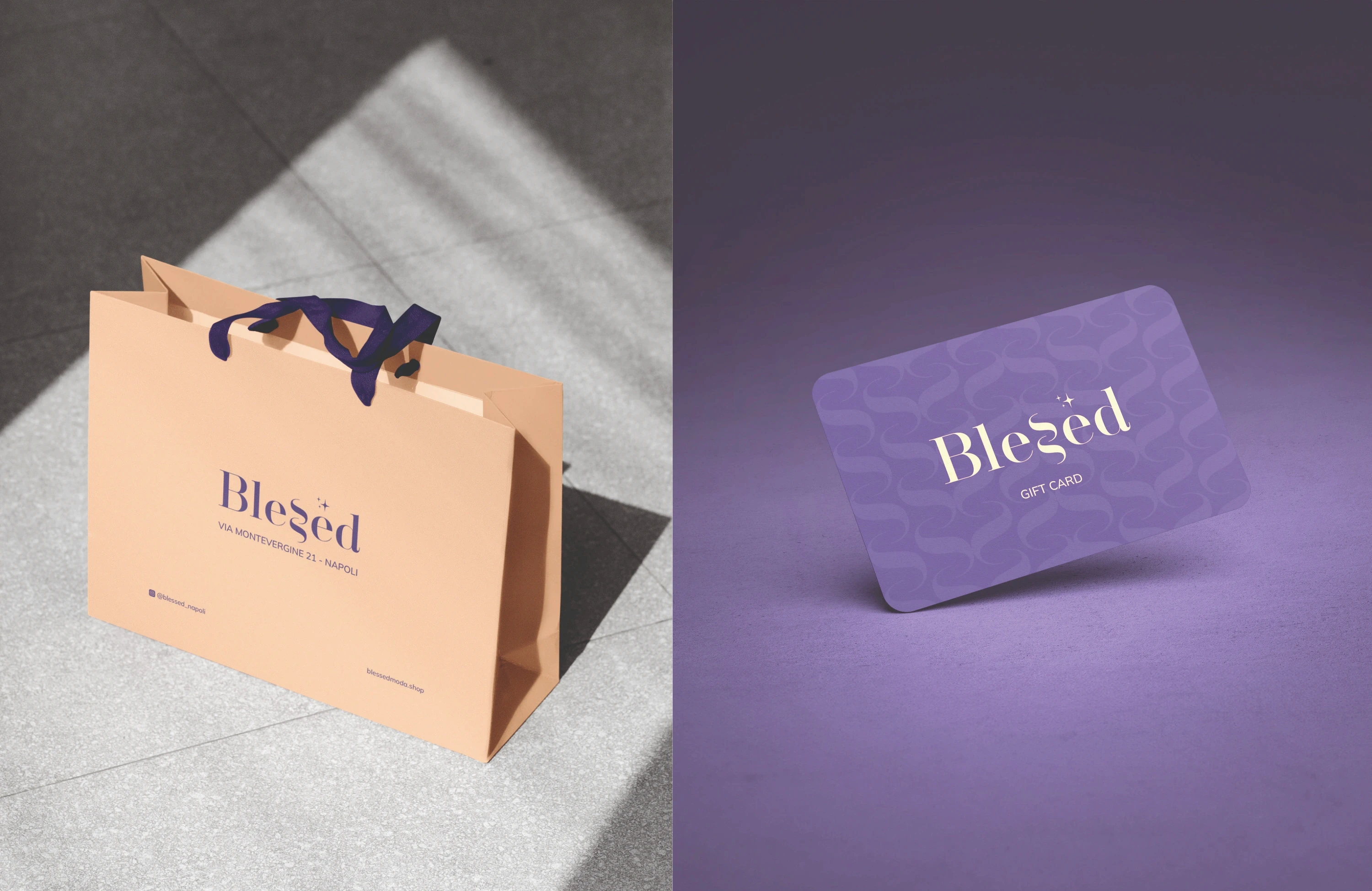
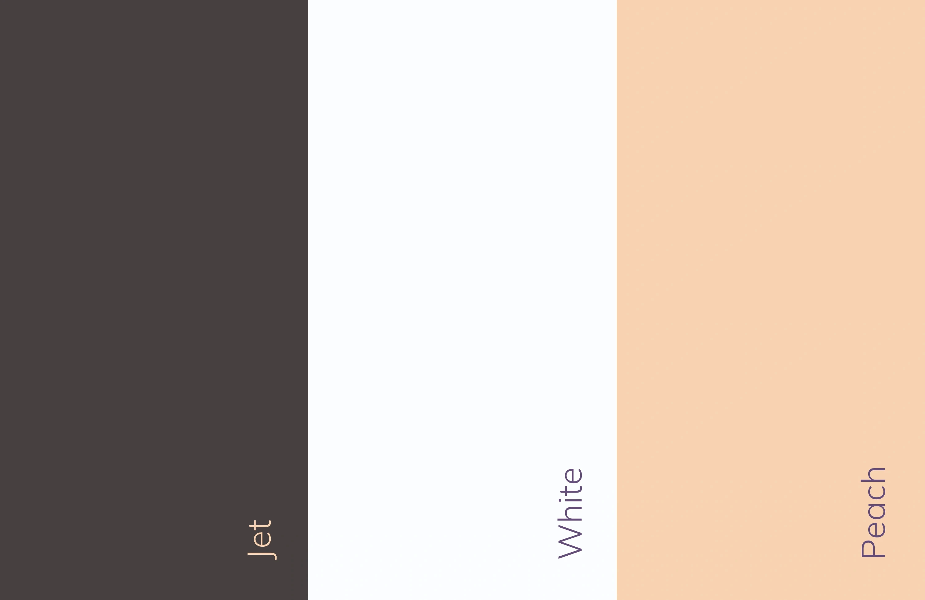
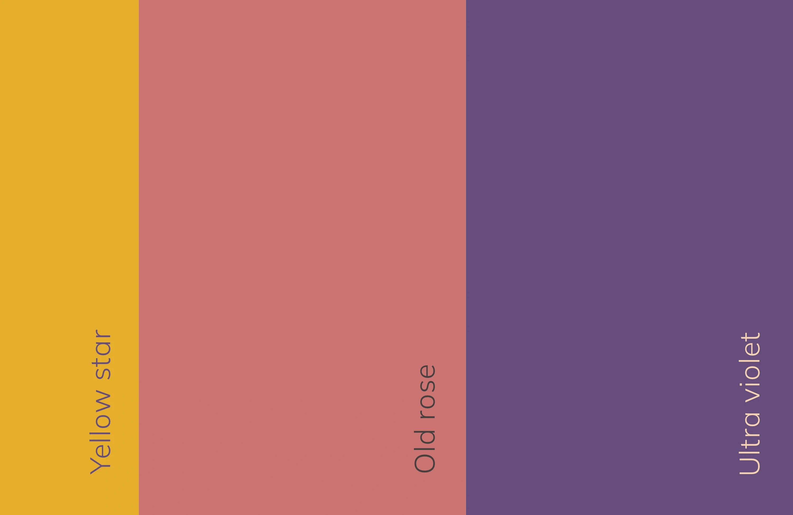
The colors are a major distinguishing weapon for this brand. In a sea of brands relying on black and white or red, I chose purple as the primary color, expressing elegance and sophistication, paired with tones of pink and yellow.
This project brought me immense satisfaction: seeing the two women's eyes light up with emotion thanks to my work motivates me to always do more and do better.
This boutique in the heart of Naples has a profound story behind it: a mother and daughter who reconnect and, through their shared passion, grow closer, giving life to a great success. These foundations – love and passion – are what I built the brand identity for Blessed upon.

Blessed
A fashionable brand identity for a high-class boutique
This boutique in the heart of Naples has a profound story behind it: a mother and daughter who reconnect and, through their shared passion, grow closer, giving life to a great success. These foundations – love and passion – are what I built the brand identity for Blessed upon.
This project brought me immense satisfaction: seeing the two women's eyes light up with emotion thanks to my work motivates me to always do more and do better.
In this case, I chose a logotype, which is the standard in the brand's market, ensuring strong recognition and brand solidity. This helps it reach people as a trustworthy boutique that can make a difference in their lives.
To convey the union of the two women, I intertwined the 'S's in the logo, like a curl of hair, and added stars to give a personal touch that represents them both.
Consequently, the font had to be chosen with great care. I opted for a modern serif font (with serifs) to confer elegance and lightness, complemented by a sans-serif font (without serifs) to improve readability and finesse.
The colors are a major distinguishing weapon for this brand. In a sea of brands relying on black and white or red, I chose purple as the primary color, expressing elegance and sophistication, paired with tones of pink and yellow.
Join others in elevating your image
Attract new clients and stand out from the competition with a professional brand identity
Book your free consultation now,
limited spots available!
Book your free consultation now,
limited spots available!
We work with a limited number of clients at a time to ensure dedicated attention and care for every project. This way, you get the best, with no compromises.
